http://jlp.holodeck1.com/blog/
2005-07-26
JLP's KDE 3.5 Previews - Part 1
Introduction
Every year, during the summer holidays, I regularly download the source code of the new version of KDE desktop that is in the works and compile and test it. If any bugs are found I report them and from time to time I also make some feature suggestions. When the feature and message freeze comes into effect I also start helping with translation into Slovenian language. This year is no exception, in most parts. One of the differences is that now I'm testing on two computers: 32-bit Athlon 1200 MHz (with Mandriva Linux 2006 beta installed and GCC 4.0.1) and a much faster 64-bit Athlon 64 3000+ (Gentoo Linux and GCC 3.4.4). It is always good to have things tested on as many platforms as possible. Another change is that this year I've decided to post previews of and experiences with development version of KDE on this blog. I'll try to put up as many screenshots as possible so that everyone can see what is coming in the future.
General
Stability of this prebeta version is very good. I rarely encountered crashes or freezes. Speed is also about the same as with current stable version 3.4.1. The default font sizes have been reduced to 10 points, which makes a little bit more room on the screen. This is how the default desktop looks like:
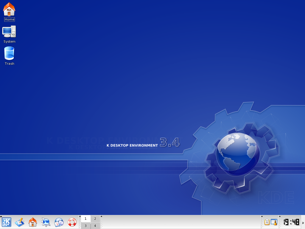
As you can see there is not much change since the previous versions. Even the version on the wallpaper is still the old one. You can expect to see more innovations in KDE 4. But there are some more or less hidden differences and some of them I'll show you next.
Kicker
The first thing I noticed was that the new tooltips, first introduced in KDE 3.4 (only for buttons), are now also used for minipager, taskbar buttons and clock. I think it would be a good idea to also use them for system tray icons.


There are now three different appearances for Kicker that you can choose from: Elegant (the default), Classic and For Transparency.


Minipager has received many improvements. It can show icons of applications, background can now show desktop wallpaper or it can be transparent. You can even drag and drop windows from one desktop to another.


Another improvement for kicker is Add Applet dialog. The inspiration probably came from GNOME desktop and it replaces the current context menu based method. It makes it quite a bit easier to find the right applet.

Storage Media Notification
Next new feature in 3.5 is storage media notification. This is something users of the current Windows desktop already have and some Linux distributions, like Mandriva, implemented their own version, mostly just as simple autorun. KDE will now also show a special dialog of possible actions when some media is inserted. I hope authors of KDE applications will soon start to add actions for their program. On the other hand it is simple to add, edit or remove actions yourself.

home:/
KIOSlaves are a special feature of KDE that make it simple to work with files and folders over different protocols. You probably know some of them very well, like file, http or ftp. A new one has recently been added: home. When you open location home:/ in Konqueror you can now see all home folders of the users belonging to the same group as you do.

Konqueror
One of the main complaints about Konqueror was that there were some menu options that just don't make sense in file managing mode and should only be shown in web browsing mode (and vice versa). The work is being done to correct this.
Konqueror now supports AdBlock content filtering. You can add simple filters by, for example, right clicking on an image and selecting to block it.

There are a lot of other behind the scenes improvements to various parts of Konqueror. And now that Apple provided access to their improvements to KHTML and KJS, KDE developers can and did backport them into Konqueror.
End of Part 1
Well, this is it for the first part. I hope you like it. I'll take a look at other applications and new developments in following articles. Expect the next one in an about two weeks. Comments and suggestions are welcome.
Translations and derivative works
Hebrew by Uri Sharf
Slovenian by Jure Repinc
One thing I'll never really like are the new "big" tooltips, very eye-candy but slow and greedy on resources; I usually turn'em off for good. That might change if they gained some kind of proper functionality, but with Plasma coming for KDE4, I suppose kicker will go the way of the dodo.

thanks
 : 7/26/2005 01:38:00 PM
 this won't happen until we have the new systray protocol (coming in kde4) .. sorry =/
@anonymous regarding the kicker border:
what are you babbling about? in svn:
a) the frame is not white (it follows your colour scheme)
b) the frame does not appear if you are using a wallpaper
@giocomo:
no, the transparency will still suck in 3.5 because we still aren't using composite for it. that will come in kde4.
as for the big tooltips, i'm really not sure where you get the idea that they are "greedy on resources". as for the "slowness" of them, that was artificial. they were paced down to take 1s to appear. in svn that has been dropped to .5s. if i let them go as fast as they could you wouldn't see the animation at all ;)
: 7/26/2005 07:49:00 PM So, whats wrong with them? First they make the user wait for the useful text by first pooping up an icon, and then gradually tone in the text. That servs no other purpose than make the user wait longer, the icon provide no extra information. Second, some users interpret the icon as something clickable and tries to click on it.
: 7/26/2005 09:39:00 PM Besides, this seems to introduce inconsistency into UI, with konqueror and others using the old FAST tips.(and I hope they stay fast as is)
Also, when one sets kcompmanager to fade windows in/out all this effort of 0.5 second eyecandy goes down the drain. I hope the developer reconciders wasting time on this and rather goes and spends some more time with family or friends.
Rounded corners are nice touch though.
Daniel D.
: 7/27/2005 12:59:00 AM Any news on the google Konqueror sidebar-improvement project?
: 7/27/2005 12:13:00 PM are the taskbar buttons in elegant mode always bleeding into each other? Isn't that bad usbaility?
: 7/27/2005 12:14:00 PM will cause problems?
: 7/27/2005 02:07:00 PM i use favorites to acces kioslaves, local locations and the like, but no matter how often i set it as visible (and save these settings to both file and web-profile); when i change view from web to fileview it dissappears :@
: 7/27/2005 04:25:00 PM << Home
![]()
